

Happy Mind
A Mindfulness Responsive Web App for Kids


UI Focused Project Overview

Role: UI Designer
Duration: 3 Months
Methods: Persona, User Flow, Mood Board, Motion Design, Wireframing, Low-Mid-High Fidelity Mockups, Prototyping, Brand Guideline
Tools: Balsamiq, Sketch, InVision, Proto.io, Lucid Chart, Milanote, Keynote

Inspiration From Books:
What Does It Mean To Be Present?
Making Mindfulness Magic
As a mother of an eight-year-old son and with years of professional experience with kids, I understood common emotional and social challenges and situations faced by Kids and the needs of parents.

Process Overview

1. Problem Statement
Kids go through many emotional roller-coasters while growing up. So how can we help them acknowledge and process their emotions the right way and develop self-help skills?
Possible Solution: A Mindfulness Responsive Web Application

2. Project Brief Highlights
Why Mindfulness?
● To become/stay healthy and enjoy the associated benefits (better mood, increased focus, better sleep, improved physical health, decreased stress, self-control, emotional intelligence, Kindness, and compassion)
● Exercise should be fun and suited to each kid’s various needs.
● To save time by fitting exercise into daily routines, such as walking or cycling to work or school.

Key Messaging
“Connect with nature and inner self.”
“Mindfulness means to live in the present moment, learn sole tasking, and be in harmony with own emotions.”
“Track your child’s progress to see how a little effort goes a long way.”
3. Competitors

Mindful Powers

Smiling Mind

Breathe, Think, Do with Sesame
Headspace
Super Stretch
4. Business Opportunities

Freemium Business Model
HIPAA Compliant
Intuitive Navigation with beautiful aesthetics
Accessible and inclusive
Evidence-based App content
Customizable
Exclusively for kids
Responsive Web App
Kids-centered App
5. Persona: Meet Rebecca And Her Daughter Jane
6. Wireframes
7. Design Direction
Animation/Motion Design
Note: Refresh the page if you can’t see the animation.
Mood Board: Fun, Engaging, Inspiring

Color Palette
Typography

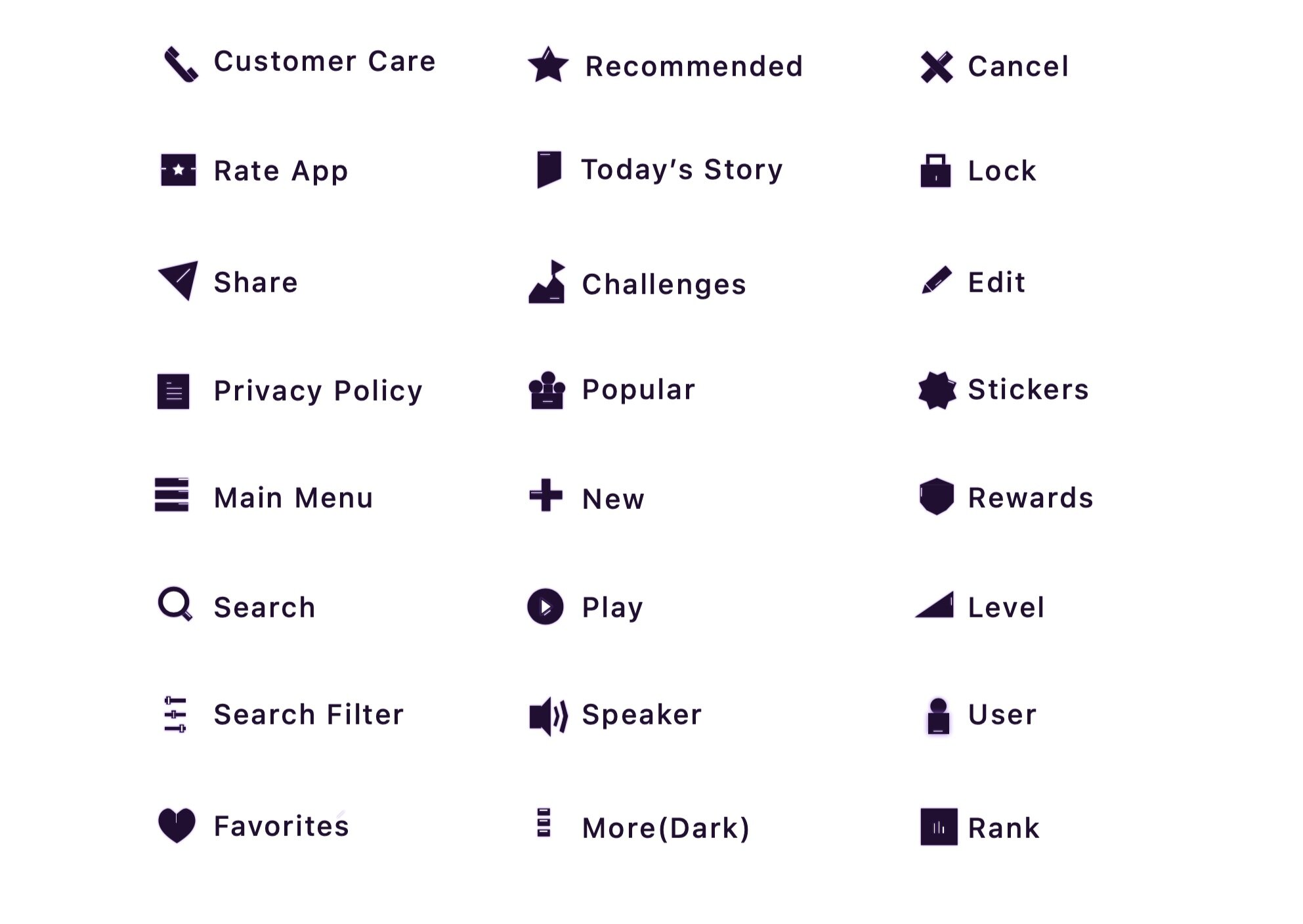
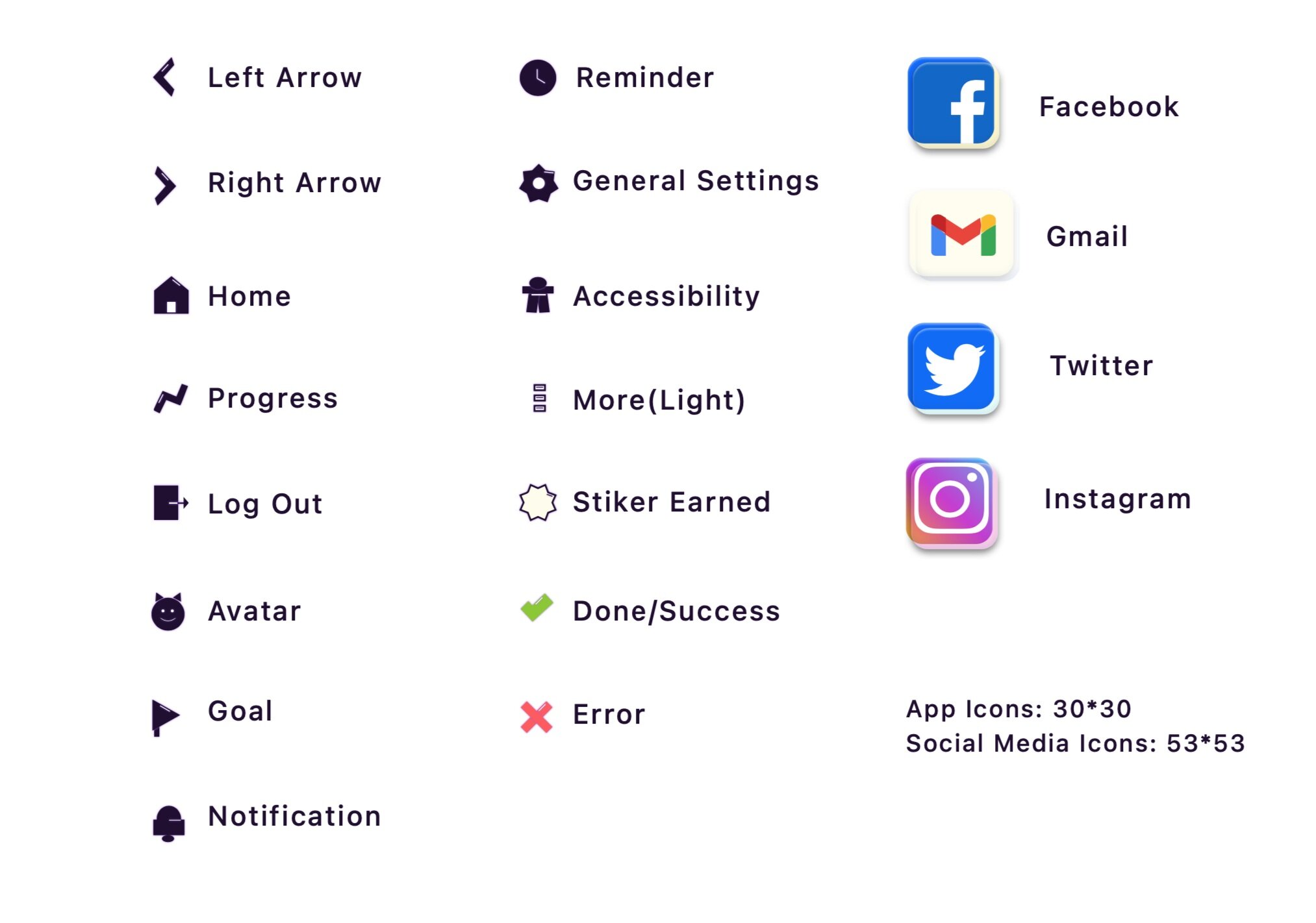
8. Icon Design
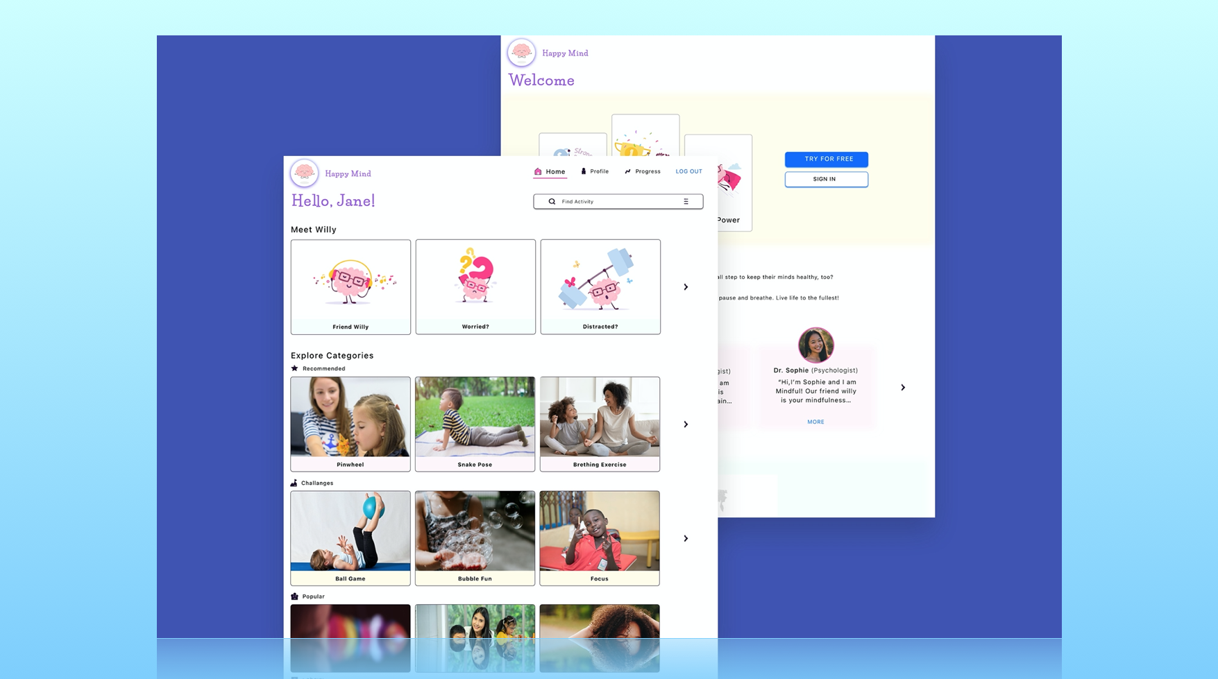
All the app icons were created based on the Project Brief and keeping persona/users in the mind.
Style: Boxy-Pointy matches well with the typography, app colors, and overall mood of the app.

9. Imagery

Appropriate Imagery
Relevant, relatable, consistent, and scalable
Supports and promotes all-inclusiveness and accessibility
Appropriate Imagery
Mascot- The Willy (Will power: The superhero within you), used to engage the young audiences, create empathy and branding purposes
Inappropriate Imagery
Irrelevant and doesn’t support the brand message
Low quality, low resolution, and blurry images
Random and distracting images as a filler and not meaningful
10. Design Evolution

Low-Mid-high fidelity Mockups_Mobile
Landing Screen

Low-Mid-high fidelity Mockups_Mobile
Home Screen
11. Style Guide

12. Responsive Design


13. In-Context Use


14. Interactive Prototype

15. Next Steps
User Testing/Feedback: Engaging, Easy to understand copy, Love Mascot Willy, Intuitive Navigation
Insights: Create Mindfulness Community, Redeemable Points Reward and Name for Animal Avatar Like Terrific Tiger (feature request from kids)
16. Retrospective
What Went Well?
Find the market vacuum and the right problem to solve
Custom designed 40 icons pack
What needs improvement?
The same design won’t work for all age groups of kids as they will have a different application using behavior, different rewards expectations, and different developmentally appropriate activities needs. It needs some changes to be personalized in the interface and experience design to suit the selected age group.

Like My Work? Hire Me!
Because you and the people you serve to deserve the best!